Appearance
Building Guides
Step Types
Every guide is made up of one or more steps. GuideSail has three step types, each suited to different situations.
Tooltip
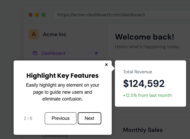
A small pop-up anchored to a specific element on your page.
Best for: Pointing out a specific button, field, or section of your UI. Walking users through a flow step-by-step.
How to configure:
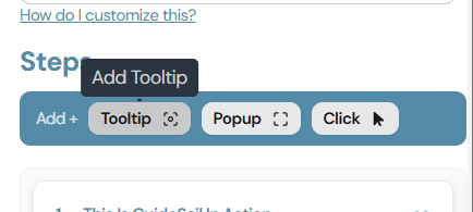
Click Add Tooltip
Select an Element: Click the element on your page you want to highlight.
Add a step title and optionally add a description for more context.
Popup
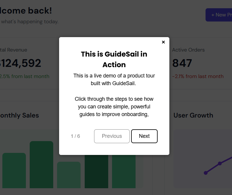
A centered dialog box that appears in the middle of the screen, not anchored to any element.
Best for: Welcome or introduction messages, announcements, end-of-tour summaries, or any message that doesn't need to point at a specific UI element.
How to configure:
- Add a Popup step and give it a title.
- Add a description — this is the main body text of the dialog.
- Optionally customize the button label in Guide Settings.
Click
An invisible step that automatically performs a click on a target element before moving to the next step.
Best for: Advancing the UI state automatically — for example, opening a dropdown or navigating to a sub-page — so the next visible step can point to something that only appears after an interaction.
Users do not see a Click step. It runs silently between other steps.
How to configure:
- Add a Click step.
- Click Select Element and click the element on your page that should be clicked.
Tip: Place a Click step before a Tooltip that points to something inside a menu or modal. The Click step will open the menu first, then the Tooltip will highlight the target element.
Step order and mixing types
You can freely mix step types within a single guide. A typical onboarding flow might look like:
- Popup — Welcome message
- Tooltip — Point to the main navigation
- Click — Open a sidebar
- Tooltip — Highlight a feature inside the sidebar
- Popup — Done / call to action